
Kuppi goes corporate.
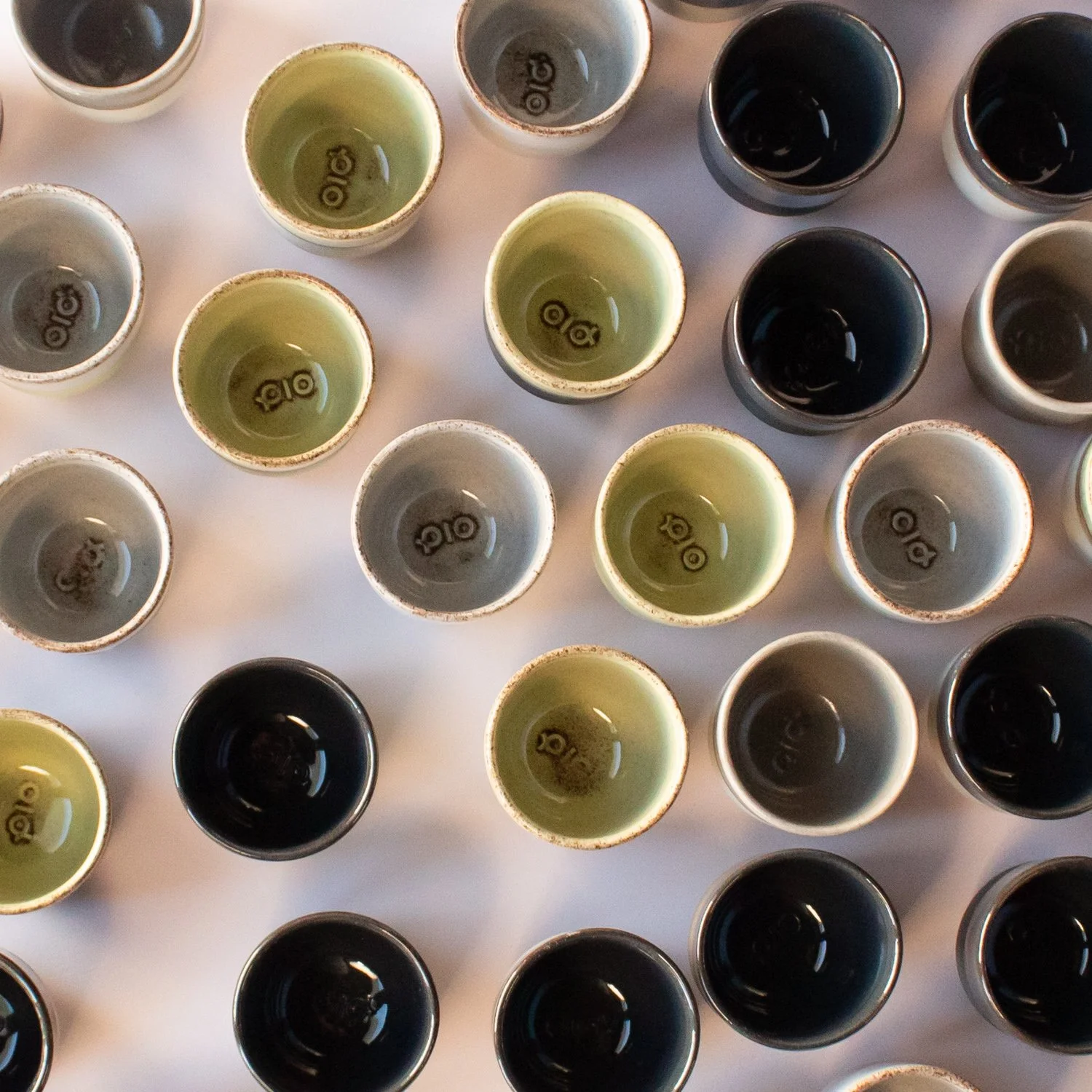
When the lovely people of little Pio (the small-business-plug-in-version of the incredible warehouse robotics company AutoStore) asked us to make cups that matched their new London-designed corporate identity, we simply couldn’t say no. We don’t do a whole lot of logo cups, but when we do they are obviously not like other logo cups. The logo is embossed by hand into wet clay, which gives each cup a natural variation.
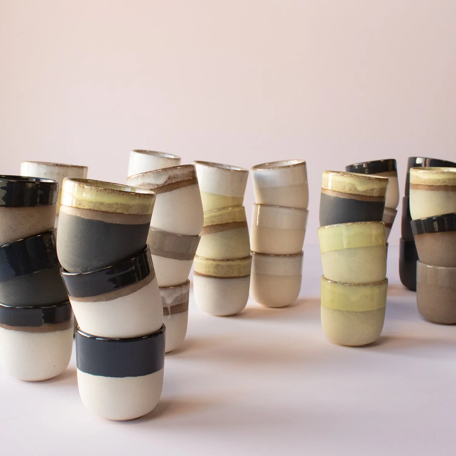
The main challenge was to develop a colour palette in coloured slip and glazes that matches the carefully developed colours of the Pio identity. Those who have tried matching ceramic colours to exact Pantone ones know that it is not an easy task. We did okay though!
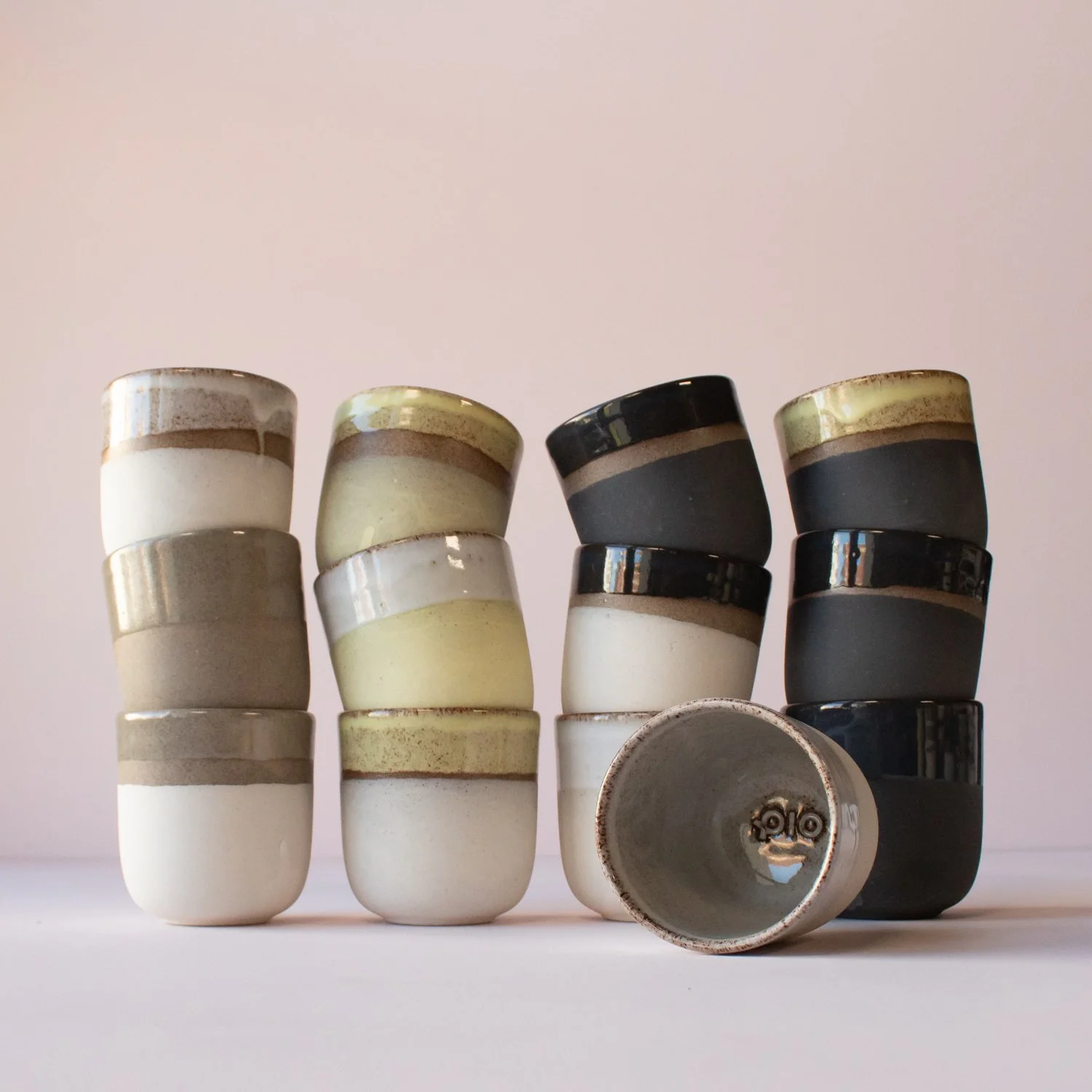
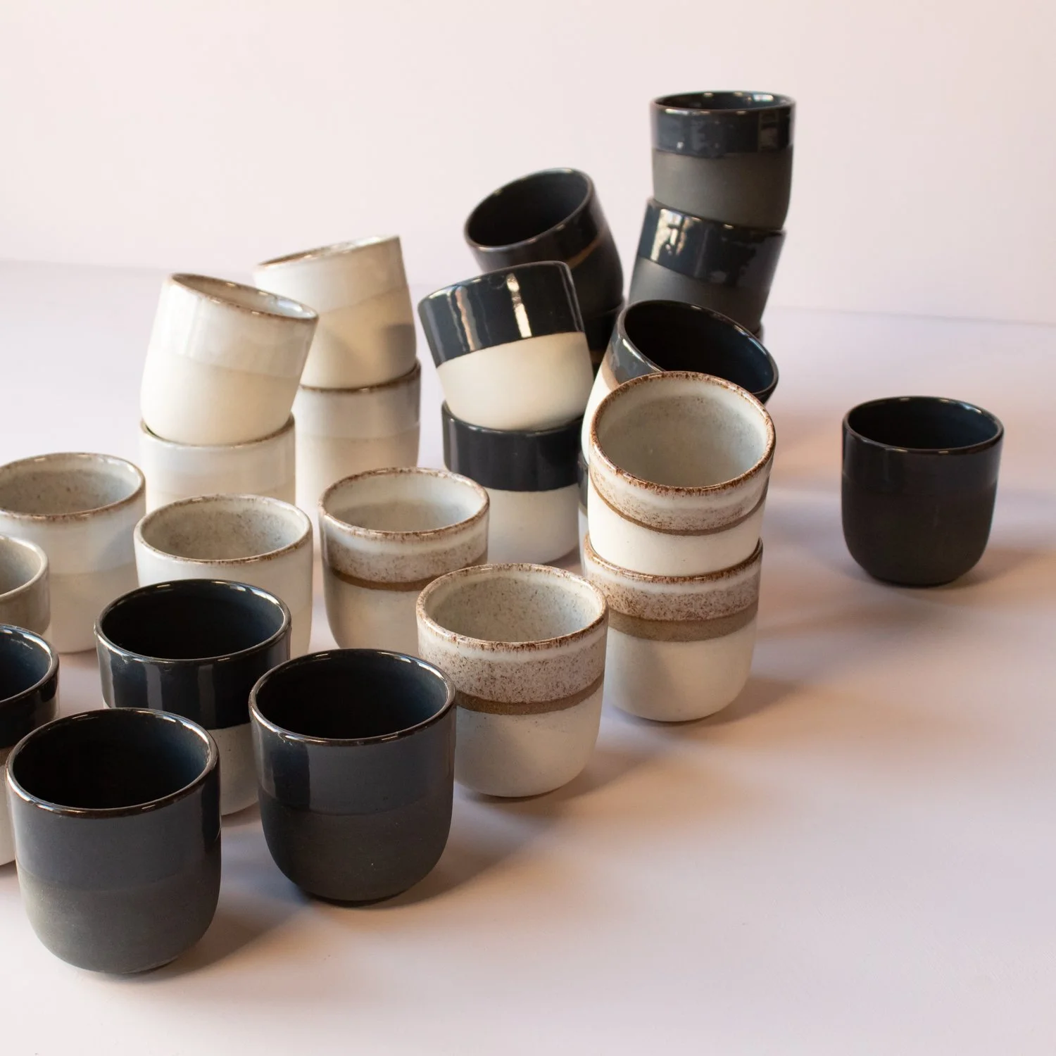
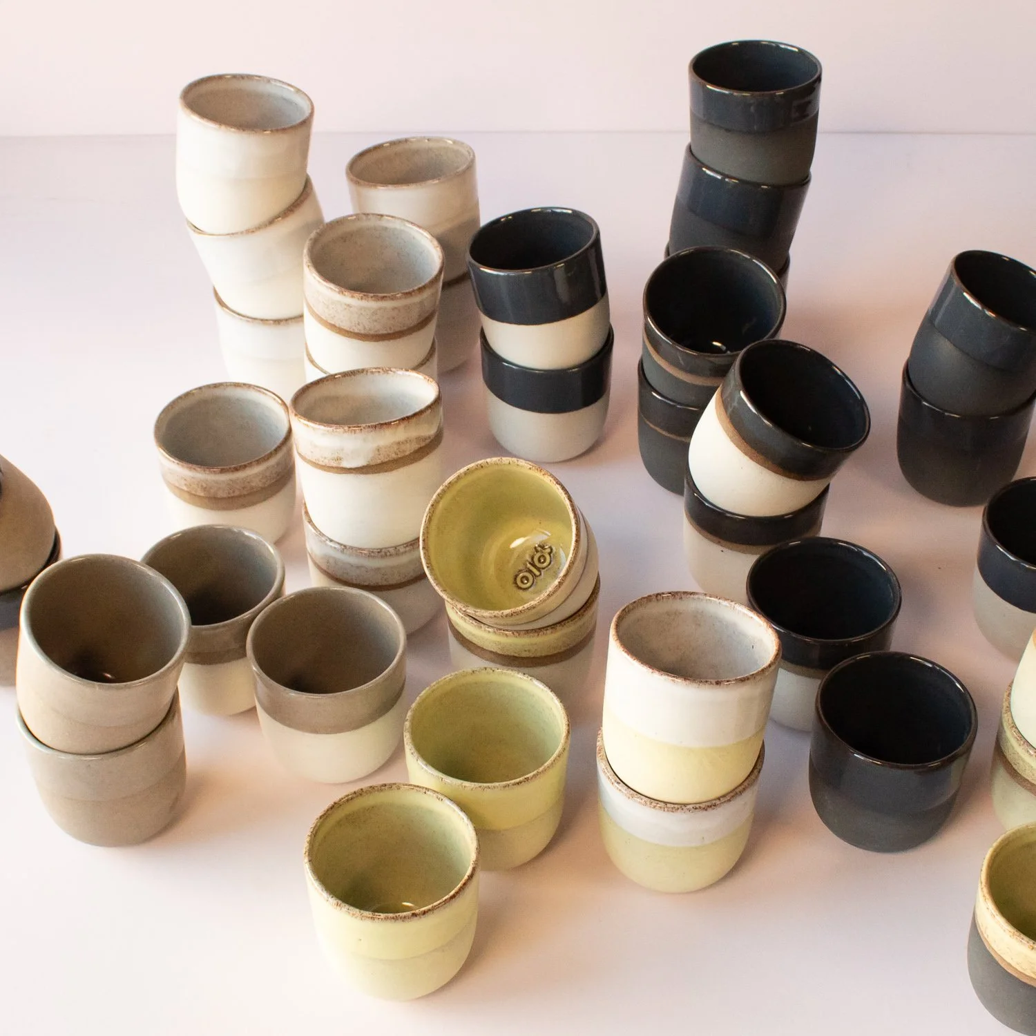
Using four base colours (the base clay or a layer of coloured slip) combined with four glazes, including options with and without gaps between the two, we created a complex matrix of near endless options. Some were eliminated, but the remaining twenty-ish varieties bring the Pio corporate identity to life in the shape of Kuppi.
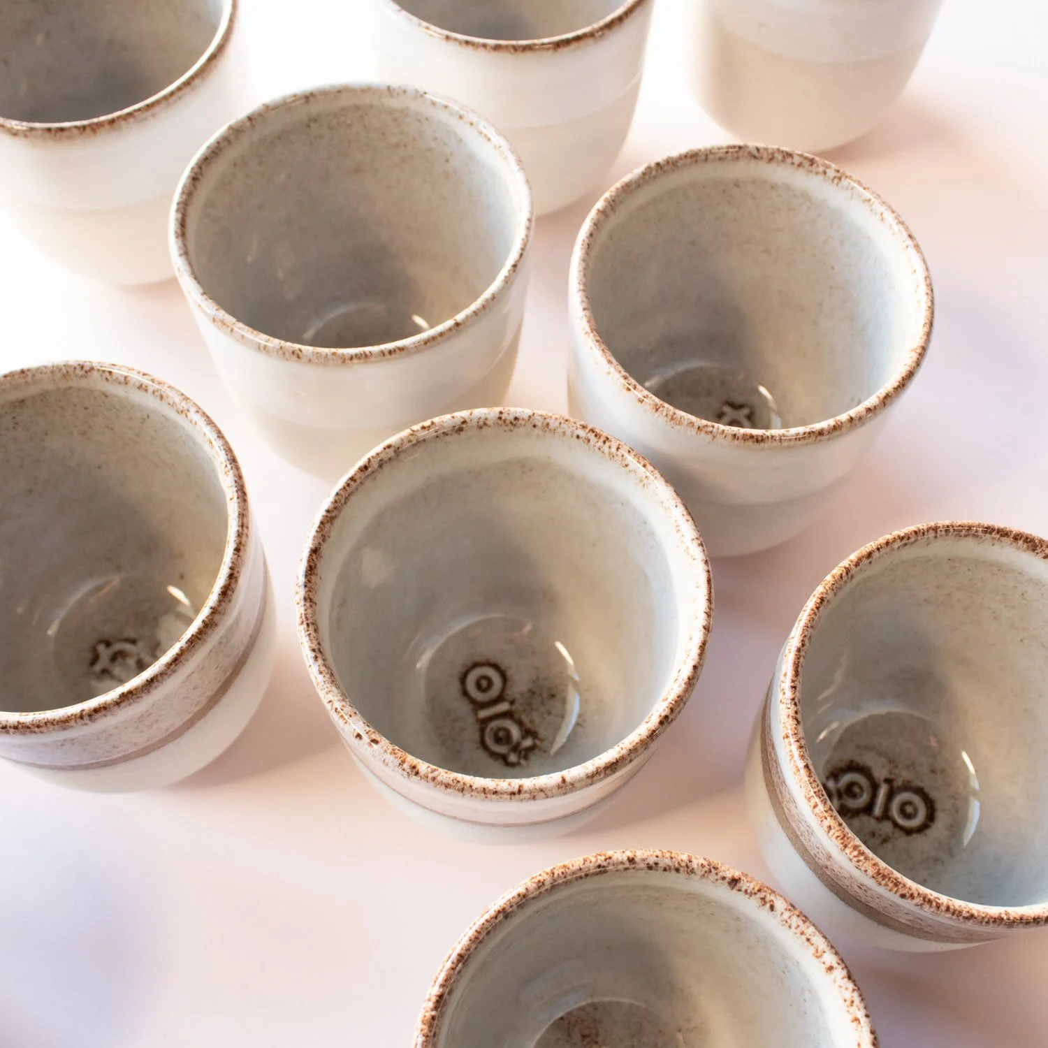
The Pio logo is stamped into wet clay as the cups are being jolleyed.
The white and white, black and black, white and black, white and white with a gap etc.

One of the sketches we used to keep track of the complex matrix of varieties of coloured slip and glaze used on the Pio cups.

Those who have tried matching ceramic colours to exact Pantone ones know that it is not an easy task. We did okay though!
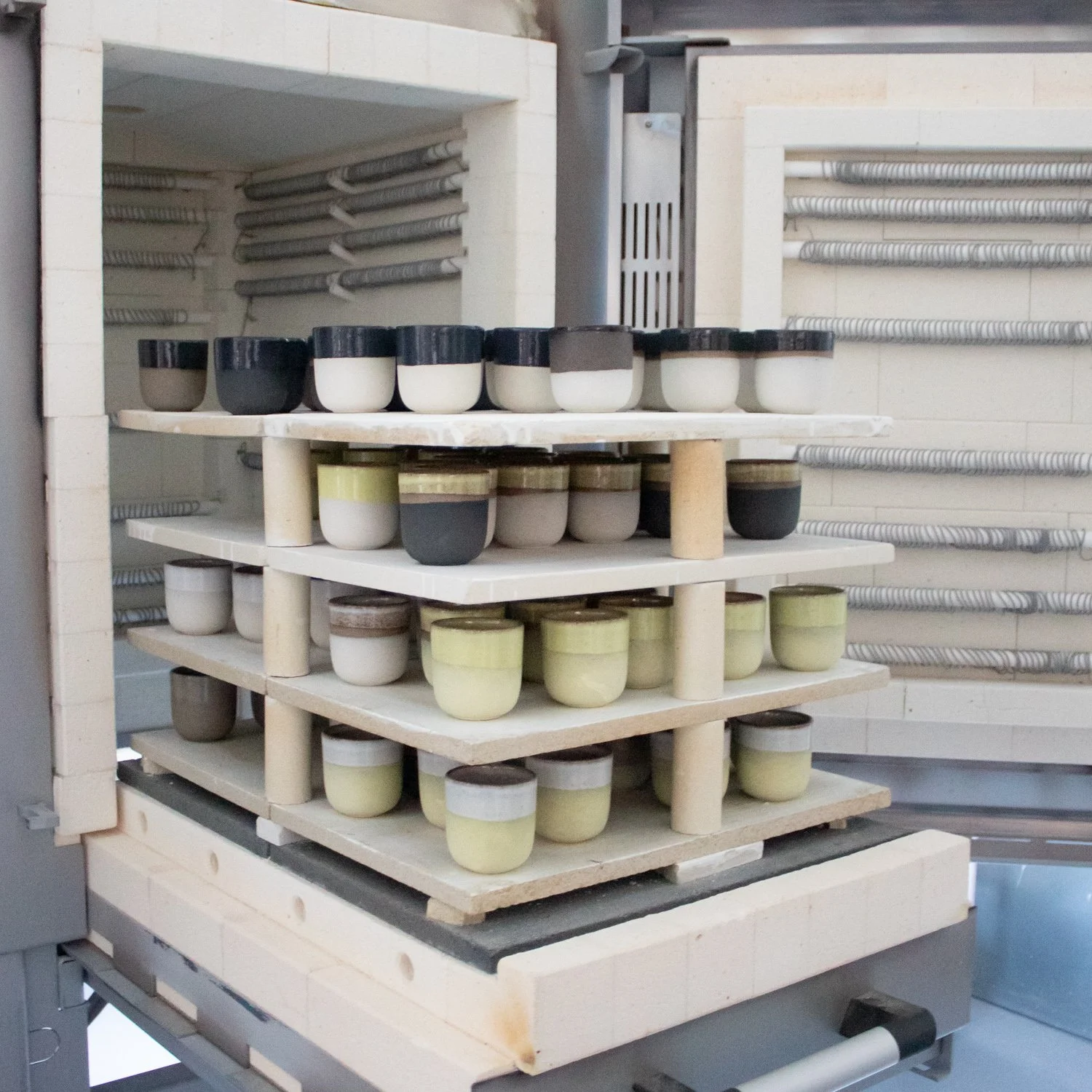
One of our kilns (this one is Standard, guess what the other one is named…) filled with Pio cups.